Refactoring portfolio
Diego Andriano
27-05-2023
1340w / 250wpm = 5.3m (with code + expanded)
Introduction
Hey! So, as you probably know, i work with a UI/UX designer, and she provided me with a new, improved, design for my portfolio stuff. It goes better with the feel i want to achieve in my site: minimalist and simple. So today i'm gonna work on it!
Tools
- Laravel
- Blade
- TailwindCSS
- Vue.js
Starting point and pre-steps
Left one is what is currently published, right one is the new one. We're gonna remove the old one and work on the new one.
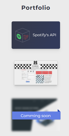
old one
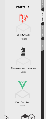
new one
The other 2 elements are quite similar in nature. There aren't many responsivity issues for any of them, just a few size changes. These new ones will be quite similar. The positive thing about these new elements, is that they're very similar when compared. But the trained eye will spot the differences.
The old ones were all over the place. Instead of 3 different elements, i can now have one component and pass some params to it, it will reduce repetitive code by a good margin. That's always a cool thing to achieve. Furthermore, there will be a much more unified design, also a cool thing to achieve.
Let's get right into it!
So, i'll mercilessly delete the old portfolio stuff. Let's thank them for everything they've done for me, and throw them where they belong: with the other removed iterations. And let's create a new component and insert it in the section where it belongs:
<x-portfolio-element></x-portfolio-element>
I've said this before, but it never hurts to repeat. Blade's components, in which this site's front end is majorly coded in, need to have prepended to them the "x-". This means that the component is actually named portfolio-element. Also, they have to be created inside the "components" folder, where my component lies.
This new component will have the entrance component wrapped over, so that's the first step:
<entrance> </entrance>
Okay, that was probably not worth a full pre tag, but who cares, sue me.
Maybe i will
Macbeth, i swear, i'll stop feeding you royal canin if you keep this behavior. Yeah, i thought so. Okay, so, starting with mobile, the half-box must be of 128px width and 108px height, according to figma. So let's hardcode that.
Then, above that, there must be space for a custom svg, so let's place the variable there. Below that, there're 2 different p tags, with title and date, with different classes. So, starting with this:
<entrance>
<a href="{{ $path }}">
{{ $svg }}
<svg class="w-[191px] h-[108px]" viewBox="0 0 191 108" fill="none" xmlns="http://www.w3.org/2000/svg">
<p class="font-bold">{{ $title }}</p>
<p>{{ $date }}</p>
</a>
</entrance>
And inserting like this:
<x-portfolio-element>
<x-slot name="svg">
<svg width="75" height="75" viewBox="0 0 75 75" fill="none" xmlns="http://www.w3.org/2000/svg"></svg>
</x-slot>
@slot('path', "https://github.com/DiegoAndriano/Connect-to-spotify-API")
@slot('title', "Spotify's API")
@slot('date', '10/21')
</x-portfolio-element>
Straight up, on our way to glory! But are we there yet? God, no. Does this look like finished to you? Stop the laziness already!.
Just inserting this because i think it looks nice and to give some air to everthing. Don't mind me, nothing to watch.
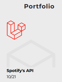
:(
Okay, gotta align them SVGs. Just a few classes to the div and the text and...
<a class="flex flex-col items-center justify-center">
<p class="font-semibold py-3">{{ $title }}</p>
<p class="py-1 tracking-widest">{{ $date }}</p>

Noice
Fixing the leaks
There's always something, right? Right. We're almost finished though, i promise (this promise is more a hopeful wish to myself than to you, to be honest).
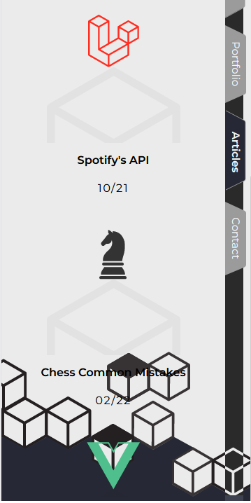
Okay, what's the issue here? The issue is my black bar (oh my!), the one on the right, is of a fixed height. And for it to work, the section itself has a fixed height. And i went on and just modified stuff up without a care in the world. Things don't work like that, Diego! 'Kay then, we need to make the portfolio section bigger and the black bar bigger. The black bar is just an svg with a height on it, so i'll just touch the number until i'm satisfied (whaa?).
Well, i have multiple SVGs for different screen sizes. 360px, 768px, 1366px, and 1920px. Each of them have the size of the next break point. I mean, the SVG that goes in the 360px screen, is of a 768px size. That way, if you resize the screen, new portions of the svg will appear and it will look nice. Also, the height of the bar is an svg and is fixed. It's actually one big svg on each section, absolutely positioned. Hence, if i add too much stuff vertically, the black bar will stay the same size and it may not look correctly (as in, it will not reach the next bar, so it will lose the "one huge bar" effect"
Wanna subscribe?
1600px seems to do the trick for mobile...
... And i just realized there's a new svg for this new design with the correct height on figma. So i'll undo the number-changing and just use that new svg. Makes sense, right? Either way, it doesn't really look too maintainable, but for now it will have to do. In my site, i don't look for perfect, just good enough for this iteration to take me to the next one.
After the new svg is placed, everything is working perfectly, thank god. Just some divs and some classes for the other resolutions and we're done!
{{-- This div wraps 2 of the 4 portfolio elements. It's so it's 1 or 2 columns depending on the size of the screen. --}}
<div class="md:my-10 flex flex-col md:flex-row justify-center md:space-x-10 space-y-11 md:space-y-11">
To finish off: some cool animations. You can check the result in the portfolio section of the site.
{{-- On the custom svg --}}
<svg class="transition duration-100 desktop-only:duration-500 ease-in-out text-[#4FC08D] desktop-only:text-[#4FC08D]/20 desktop-only:translate-y-[100px] desktop-only:scale-[80%] group-hover:translate-y-[0px] group-hover:text-[#4FC08D] group-hover:scale-100" width="77" height="68" viewBox="0 0 77 68" fill="none"
{{-- On the a tag of the half-box svg --}}
<svg class="w-[191px] h-[108px] group-hover:text-[#d1d1d1] text-[#e2e2e2] transition duration-150 ease-in-out"
{{-- On the a tag --}}
<a href="{{ $path }}" class="flex flex-col items-center justify-center group">
Last words.
Believe it or not (i sure can't) this was made in just one day or work. (not really a whole day, just a way of speaking, of course). This was done completely for me, and 100% for fun, and it's been a long time since i didn't code just for fun. Probably, since the beginning of my professional career. Not trying to make something perfect, or think about every damn edge case, just moving something forward and having fun while at it.
I'm starting this blogging-as-a-hobby as a way to reconnect to the fun side of programming. Talking a little with myself while working, maybe trying to make it fun as i go, and code from a different angle from the one i use in the daily life.
Coding can be fun, coding is fun, it's just that sometimes with all the intricacies, all the stuff you have to think and worry about, and the fear of failure, puts this heavy emotional burden to programming, which can make it easy to break down and cause the infamous "burn out".
I'm blogging in a quest to code for fun. To just create and do stuff for the sake of creating and doing stuff.
Feel free to @ me on twitter. Thanks for reading and i hope you enjoyed it,
Have a good day!